The change

With over 300 nurseries up and down the country, Bright Horizons is one of the UK’s leading childcare providers. But following the pandemic and with an ever expanding offering to its B2C and B2B audiences, it had a new story to tell.

Our challenge was to create a visual identity and voice that reflected its heritage and ambitions for the years to come. With ‘We Look Forward’, we delivered a bold and optimistic vision for the future of its workforce, clients, parents, and children.

A campaign advertisement concept board for Bright Horizons headlined "The whole solution for whole people," featuring black-and-white illustrated vignettes of family life and working parenthood displayed on green grass.
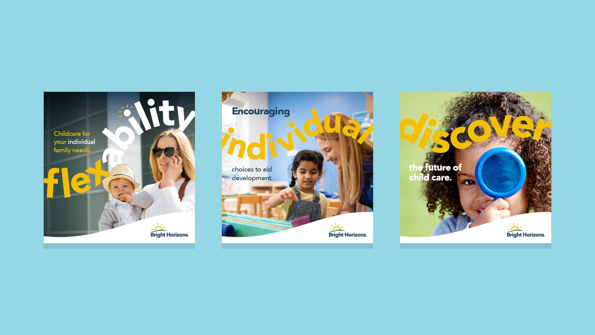
A triptych of branded Bright Horizons social media campaign squares highlighting core pillars of flexibility, individuality, and discovery in modern childcare.
A triptych of colourful Bright Horizons campaign posters in yellow, navy, and green, uniting child development, corporate family solutions, and career recruitment under a shared "shine" visual mechanic.
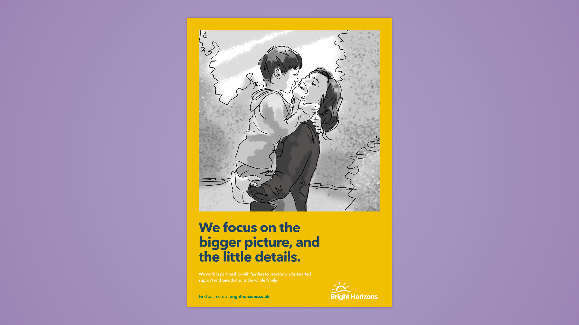
A Bright Horizons campaign poster featuring a black-and-white illustration of a mother embracing her young child above the headline "We focus on the bigger picture, and the little details." against a golden-yellow background.
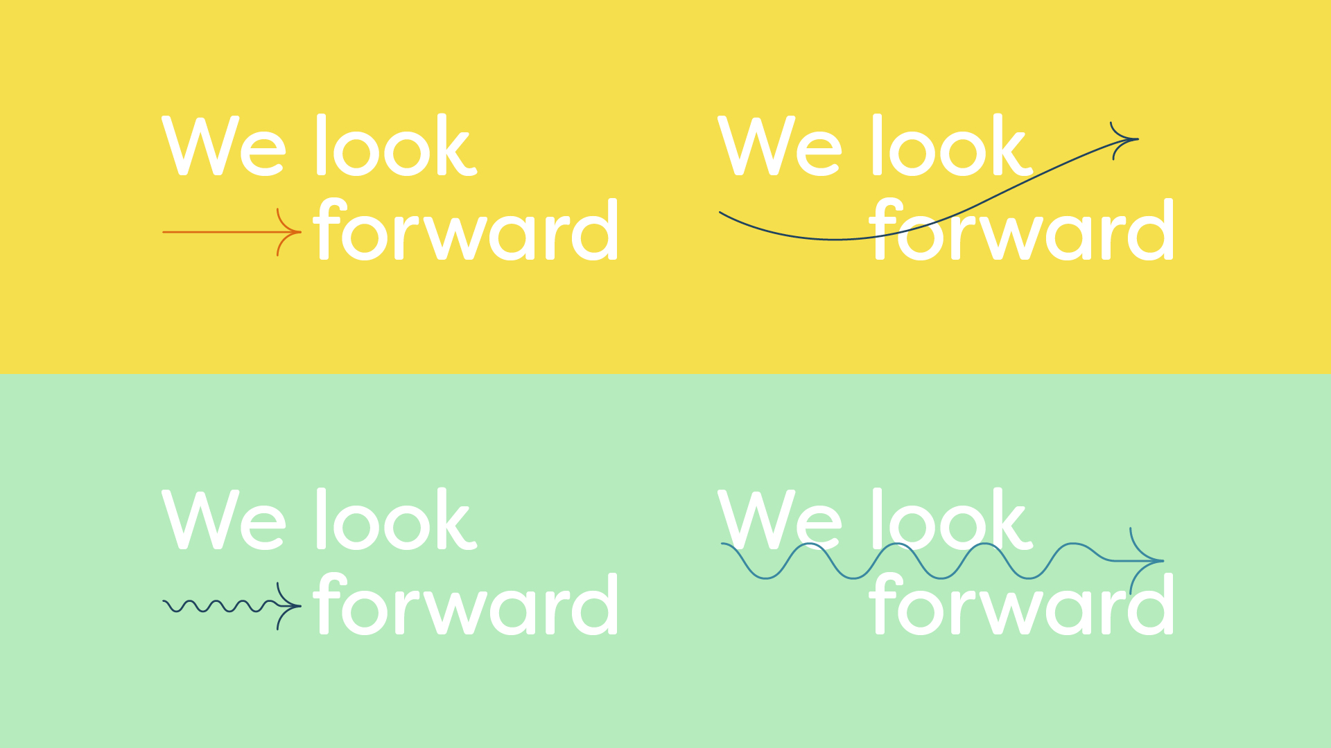
A four-quadrant graphic across yellow and mint green backgrounds displaying different typographic iterations of the Bright Horizons "We look forward" brand lockup paired with illustrative arrows.
Bright Horizons we look forward colourful logo
colleagues discussing work

As a working mum myself, collaborating with Bright Horizons to communicate a vision of a brighter future for working families was a real honour. Bringing emotion, creativity and lived experience to a project such as this is a ‘once in a career’ joy and it’s a project we’re all so proud of.

Sophie Dickens – Senior Account Manager
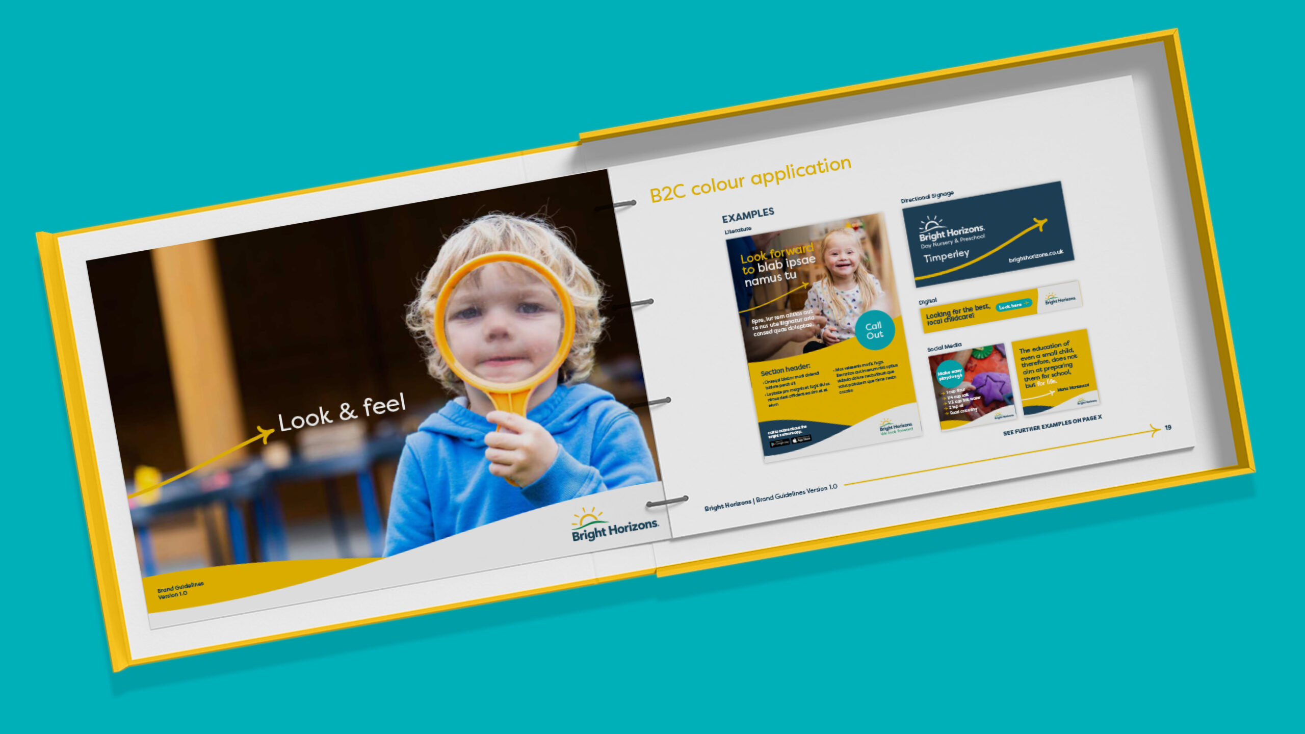
A presentation mock up of the Bright Horizons brand guidelines manual displayed inside an open yellow box, showcasing the "Look & feel" photography style and "B2C colour application" collateral examples.
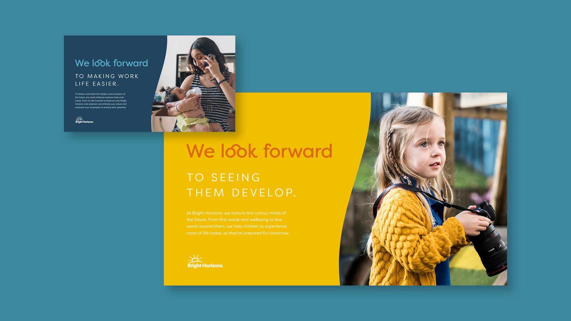
A pair of overlapping branded campaign cards for Bright Horizons displayed on a teal background, illustrating corporate work-life balance and child development.
two colleagues discussing work
A dynamic collage of digital advertising banners for Bright Horizons Day Nursery & Preschool, showcasing cheerful nursery photography and teal call-to-action buttons arranged in an angled grid
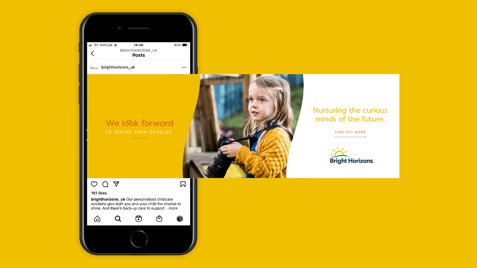
A smartphone displaying a seamless Instagram carousel advert for Bright Horizons UK, featuring a young girl holding a camera alongside brand messaging against a golden-yellow backdrop.
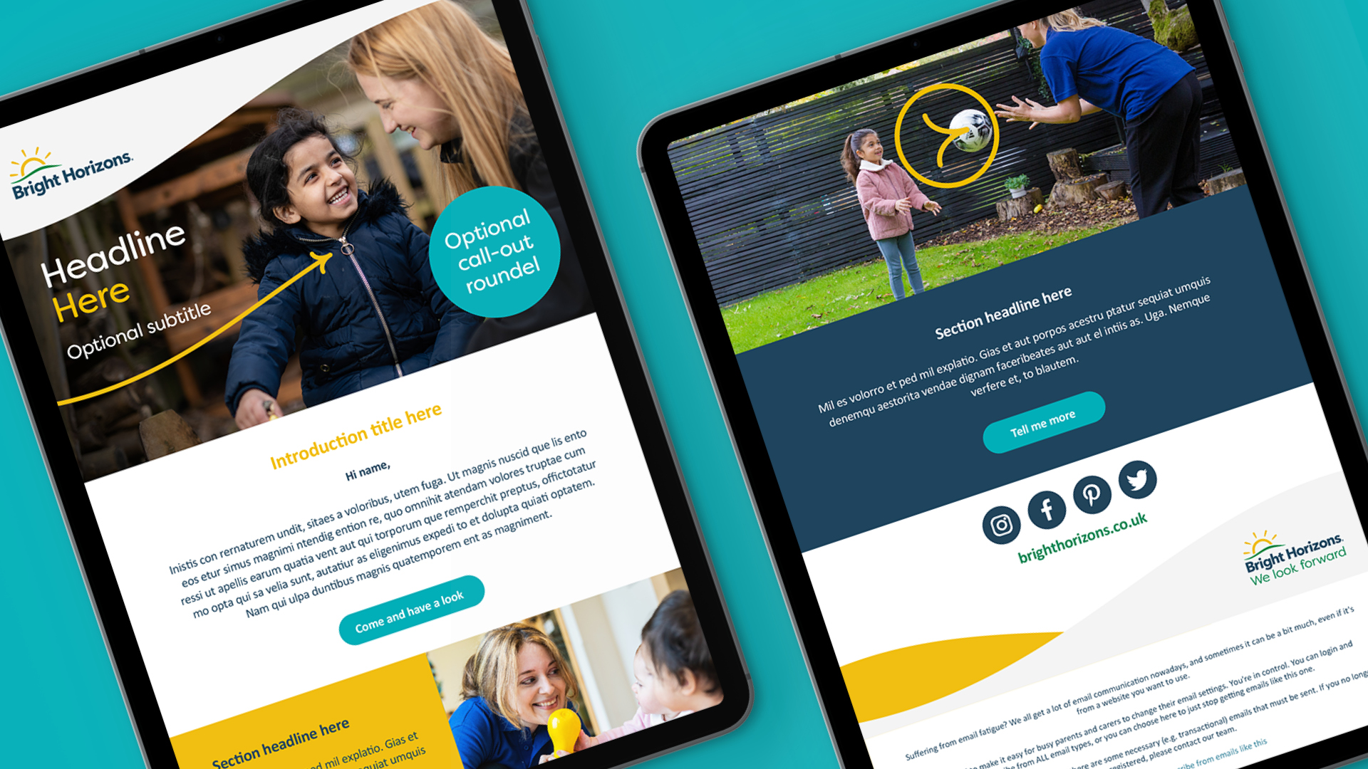
A pair of digital tablets presenting a modular, responsive email newsletter template design for Bright Horizons against a turquoise background.

Client

  • Bright Horizons

Deliverables

  • Brand Guidelines
  • Brand Identity
  • Brand Narrative & Storytelling
  • Brand Purpose
  • Film Production
  • Motion Animation 
  • Strategic Consultancy
  • Strategic Positioning