The Joshua Tree Rebrand
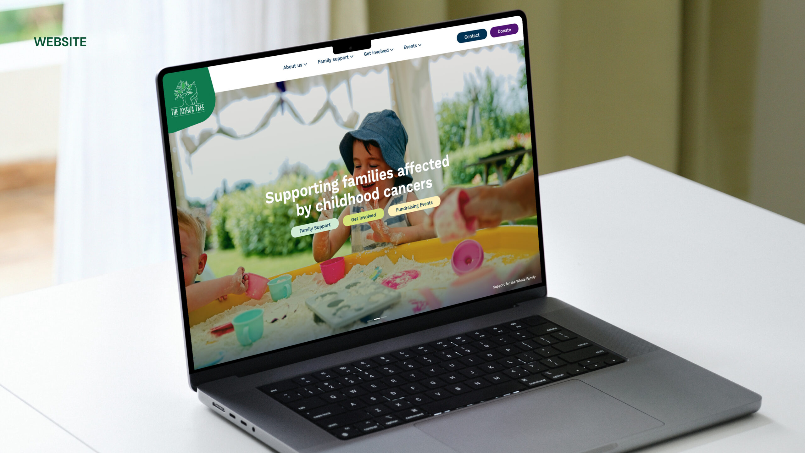
Supporting families affected by childhood cancers
The Joshua Tree charity has spent two decades supporting families affected by childhood cancers. Offering emotional, physical, and wellbeing support before, during, and after treatment, the charity focuses on the whole family, not just the diagnosed child.
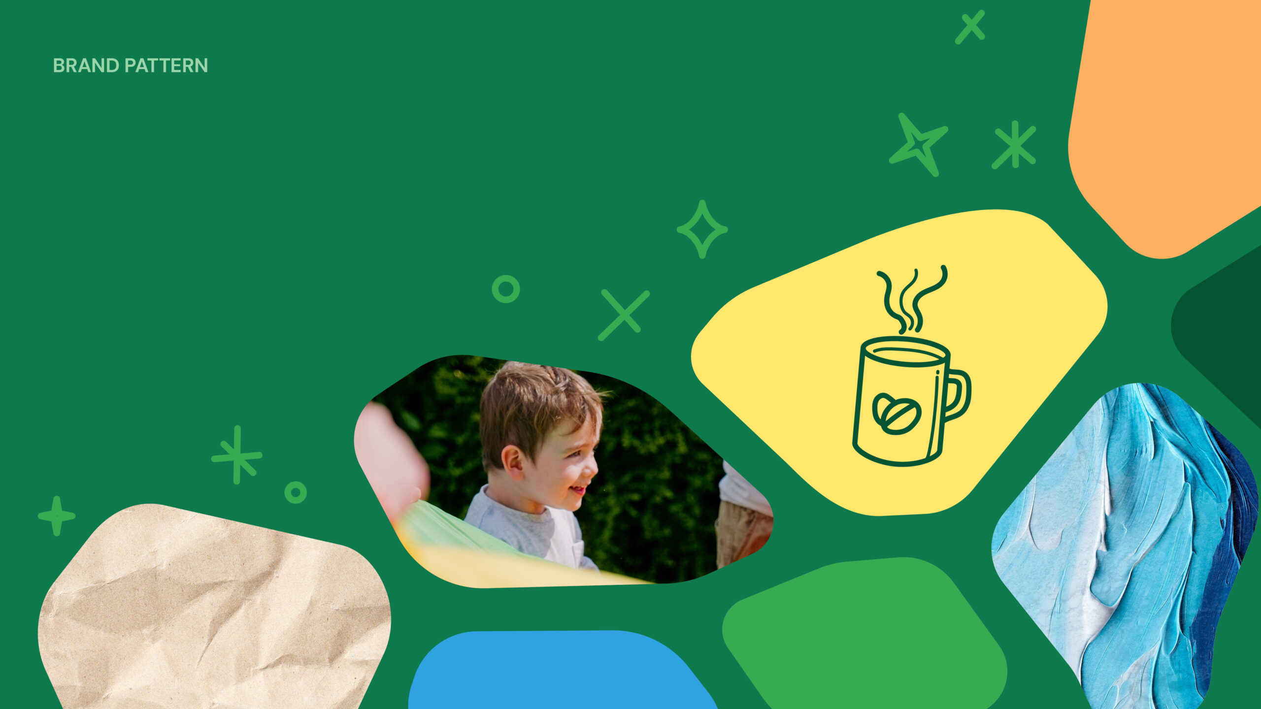
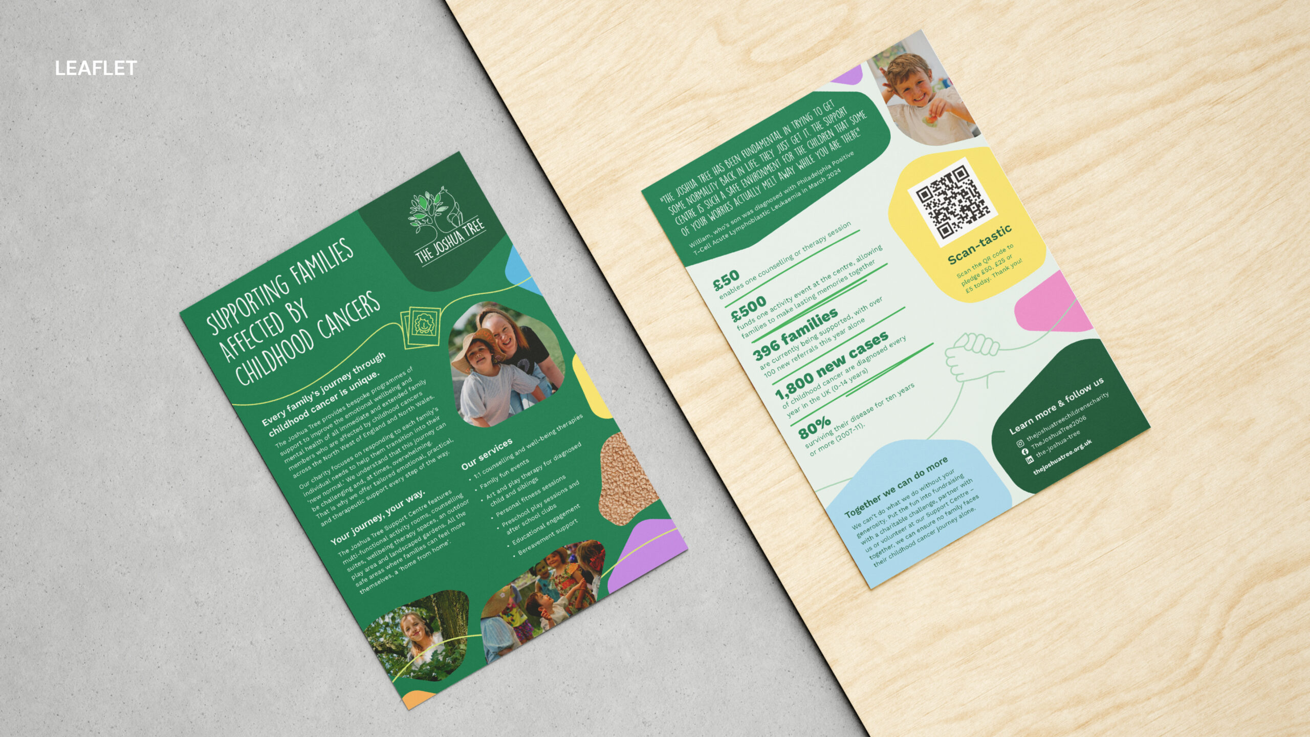
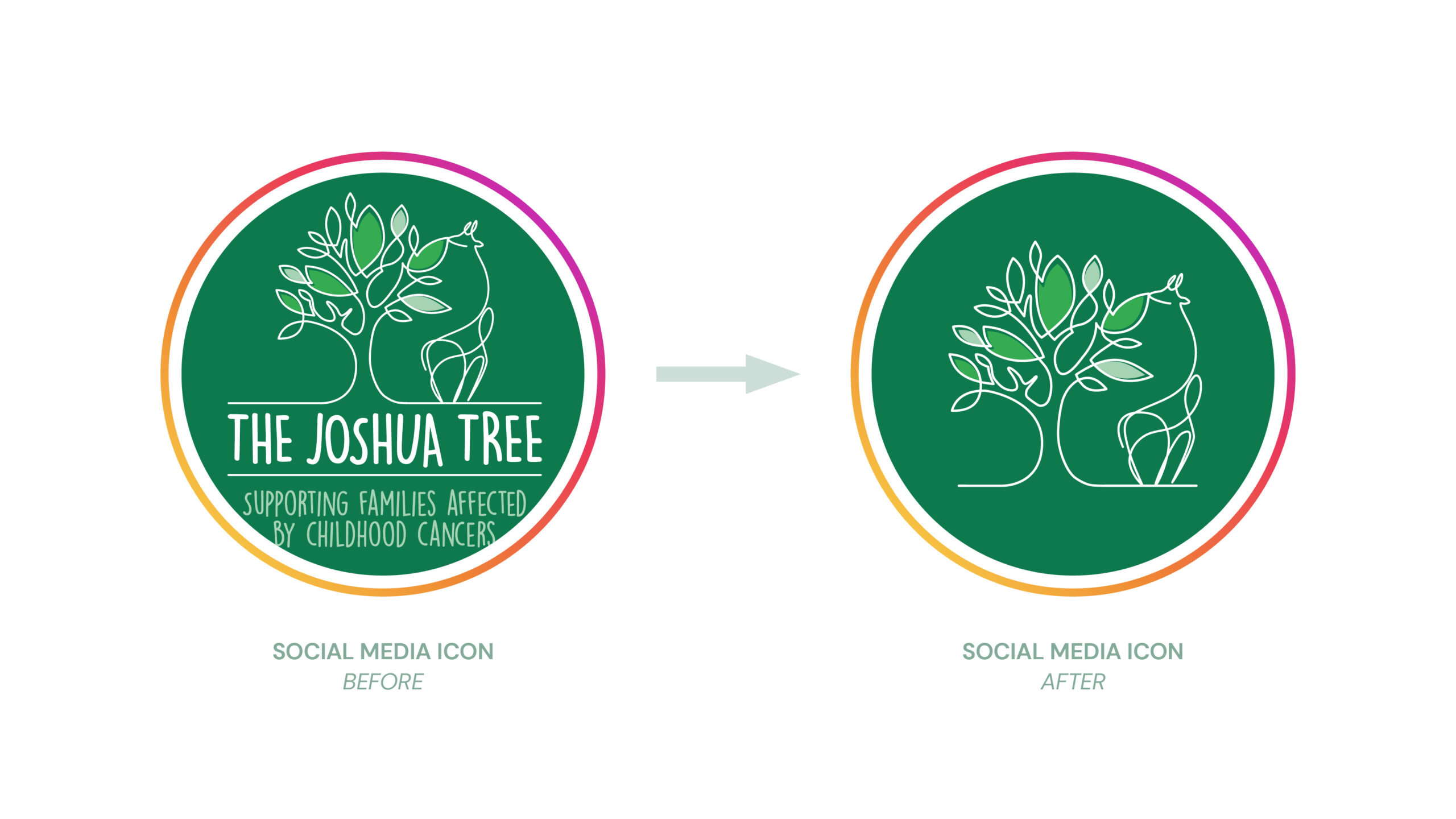
The Joshua Tree came to us to help them create a new identity that better reflects the warmth, care, and hope at the heart of everything it does. We introduced a fresh, colourful look that feels natural and warm.
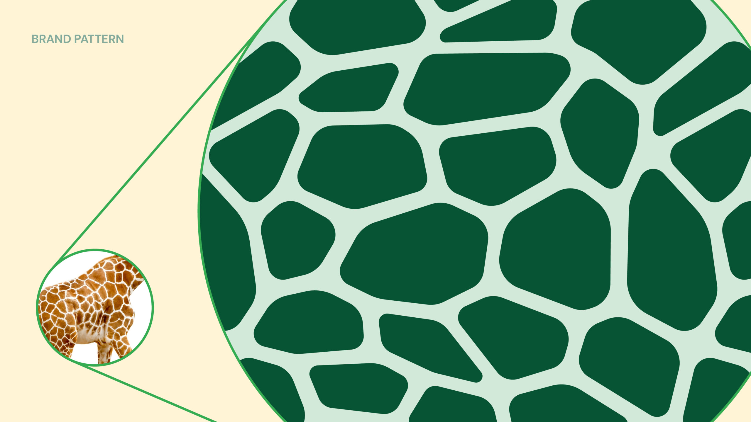
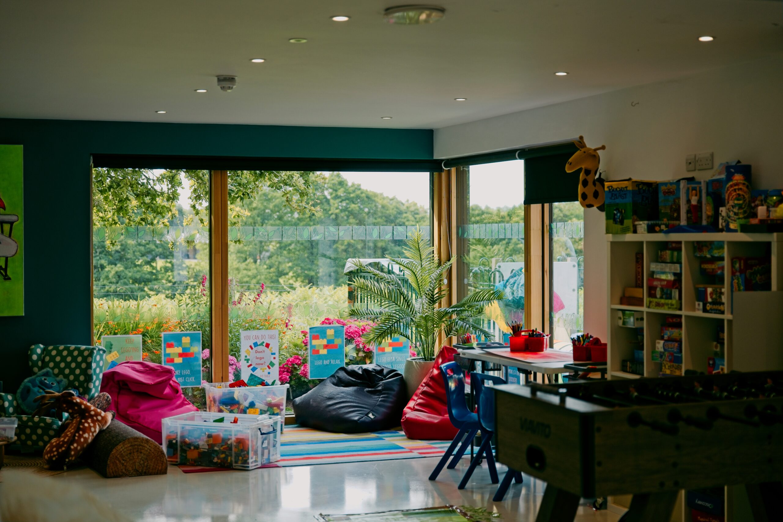
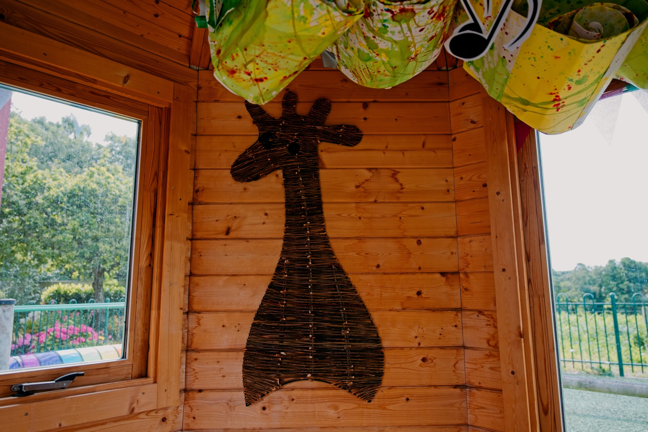
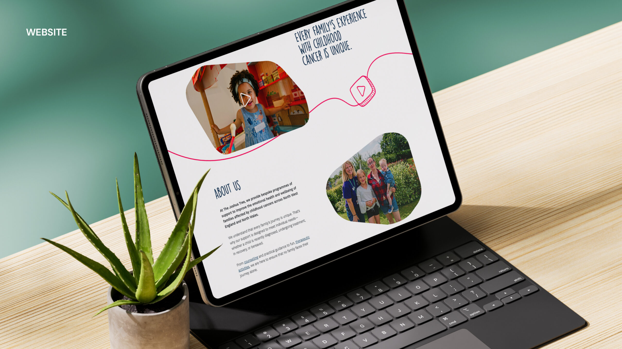
A conceptual approach centred on the giraffe pattern, a symbol synonymous with the charity, became a defining visual element. We used this to showcase textures, colours, and imagery that reflect the feel of the centre itself.
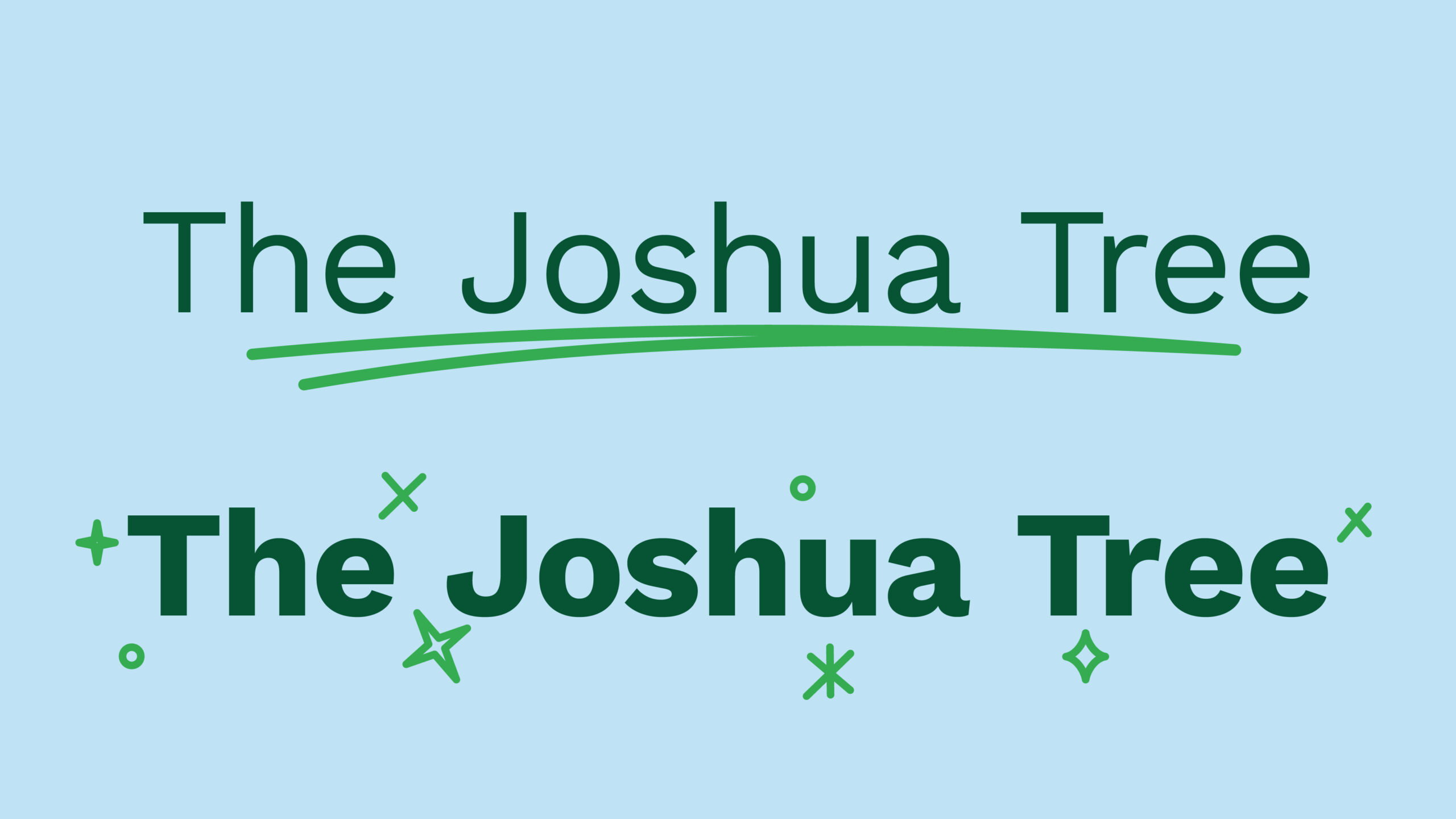
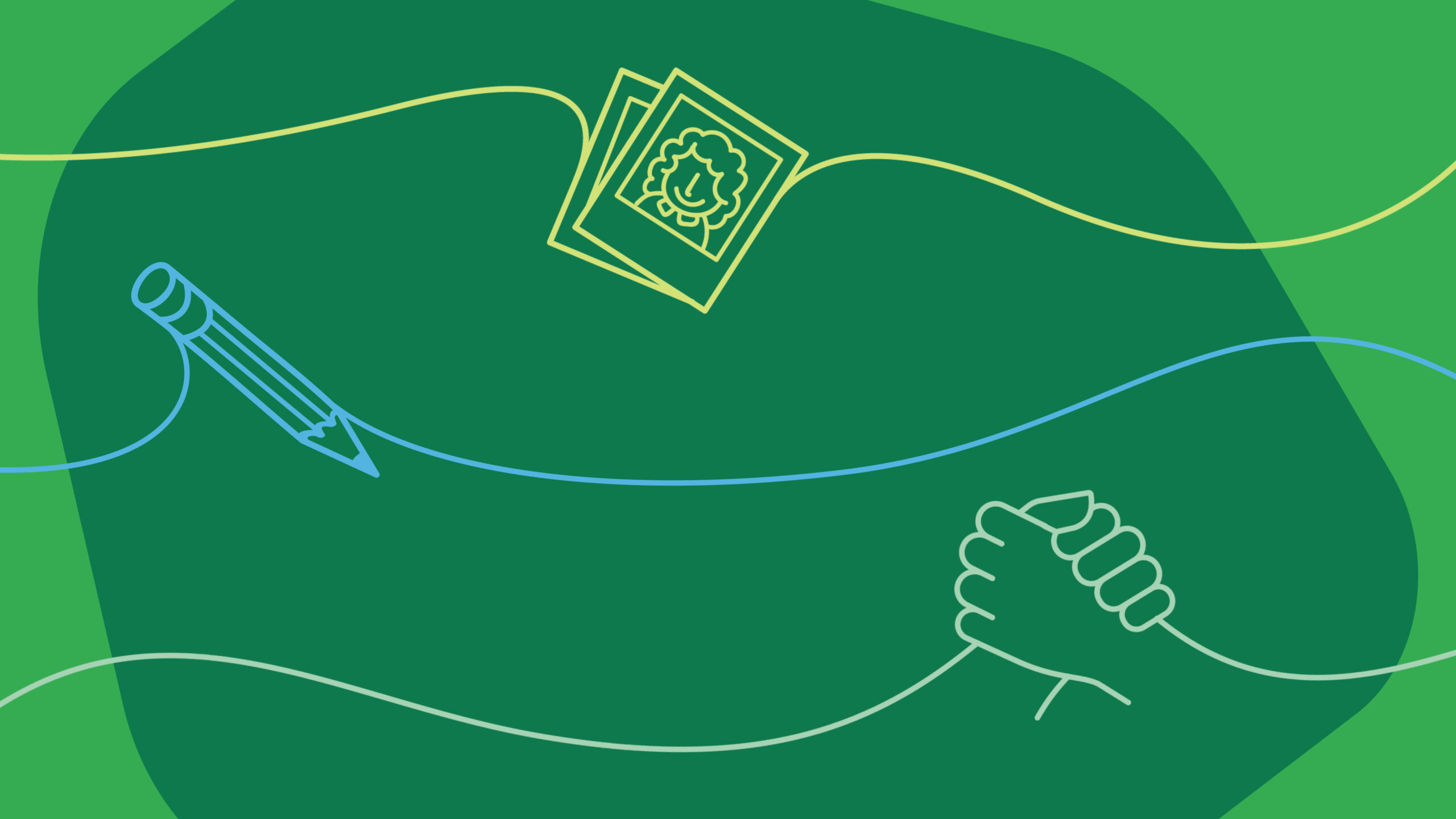
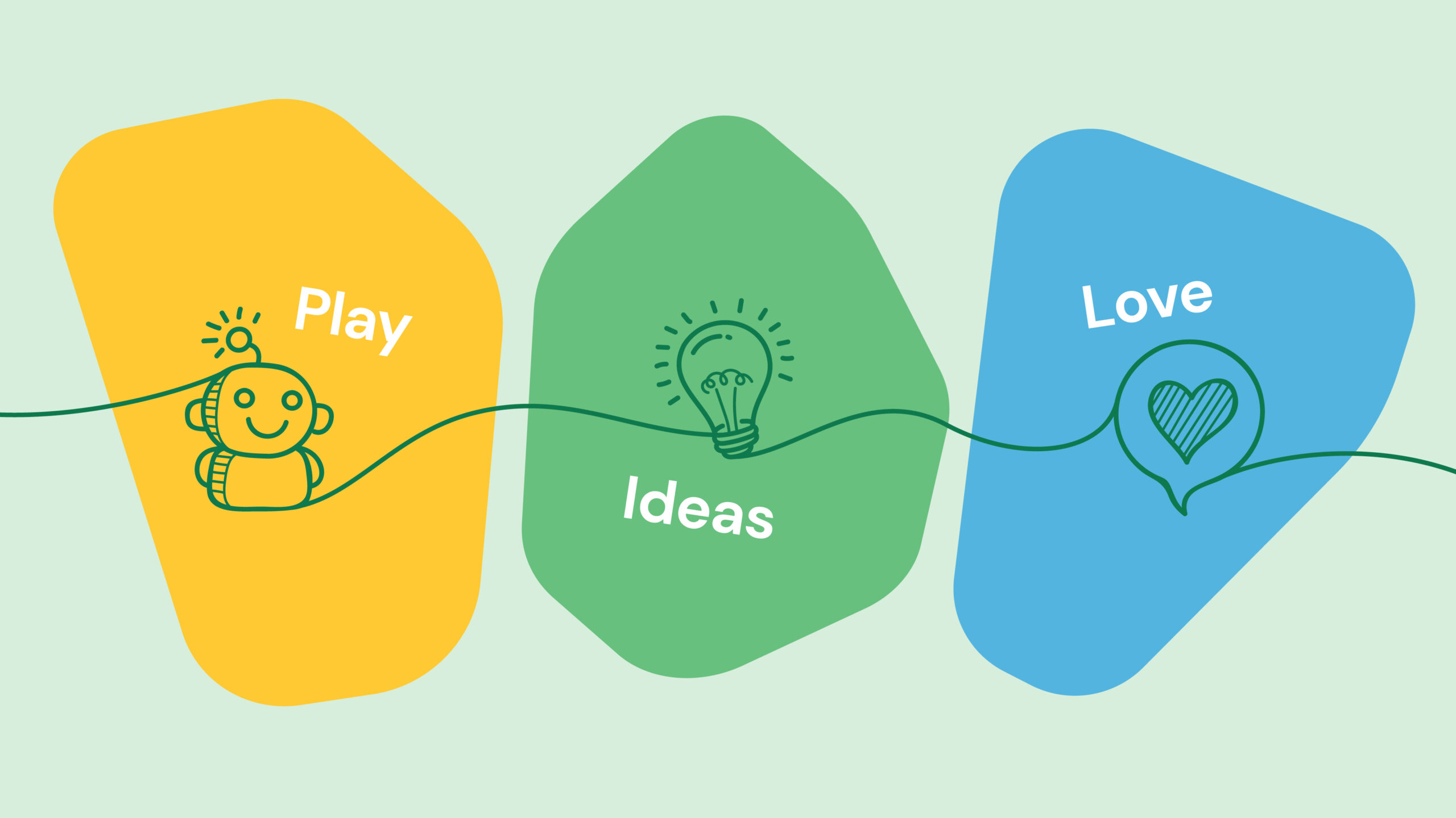
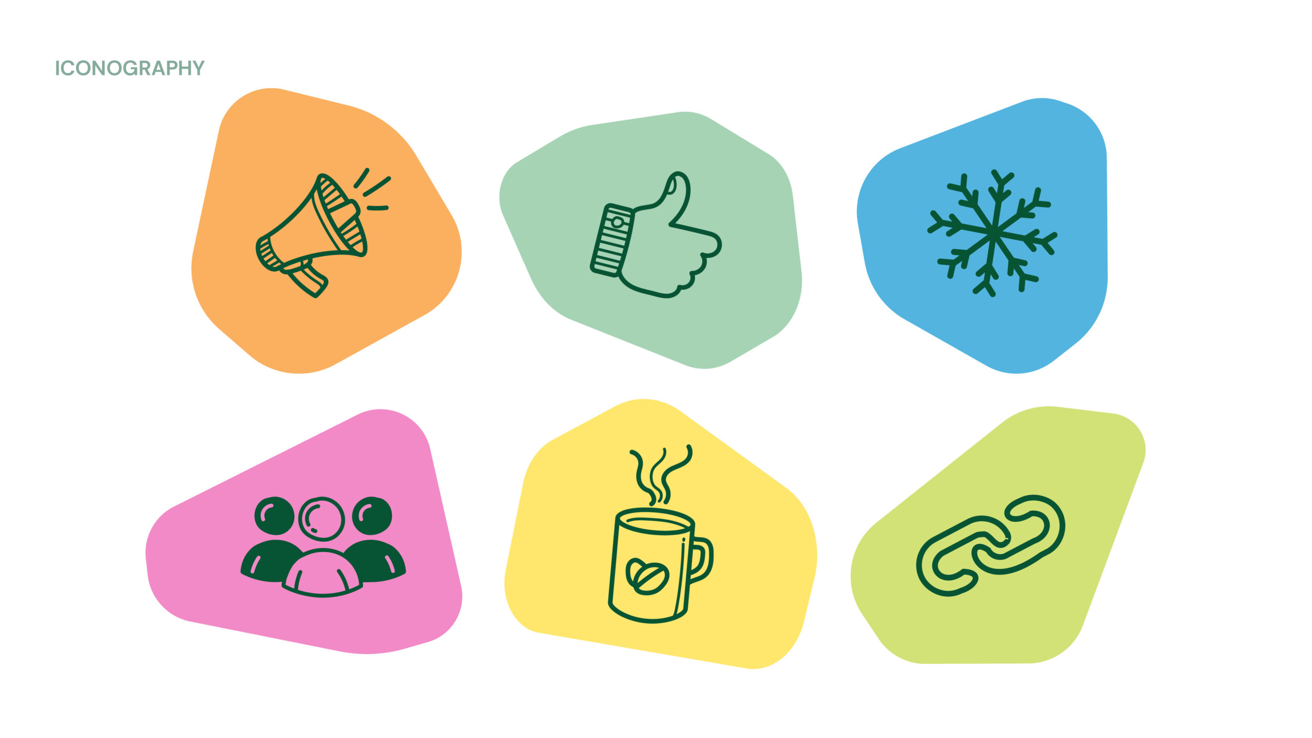
Hand-drawn lines, playful icons and updated fonts completed the transformation. A design that informed the look and feel of a new website that would better help the centre support its families now and in the future.
Working with the 438 team has been such an enjoyable and rewarding process. From the early design stages, where they visited our centre and truly captured the feel of the space, to seeing those elements come to life in our channels like the technical build of the website, every step felt thoughtful and collaborative. In this case, the result is a site that genuinely reflects who we are and the warmth we offer to families. Even though it’s a brand-new website, it still feels familiar and unmistakably The Joshua Tree.